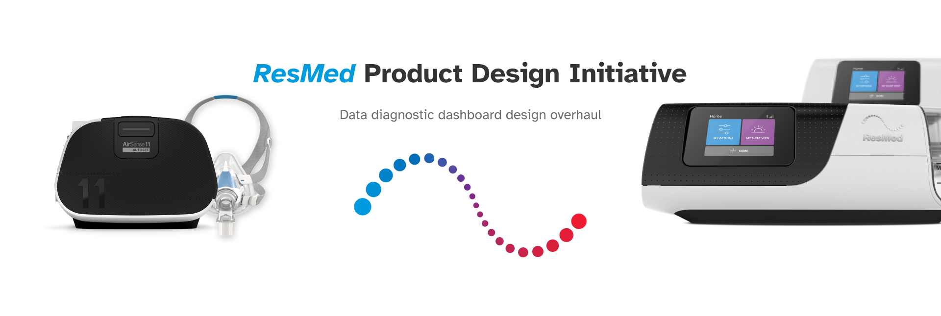
At ResMed, I led the design overhaul of a critical data diagnostic dashboard used by our customer care team. In collaboration with a product manager, I guided the redesign of the LOST (Launch & Operational Support Tool) dashboard from initial discovery to concept delivery. My responsibilities included conducting user interviews, synthesizing pain points, translating insights into high-fidelity wireframes, and creating a comprehensive product requirements document, ensuring the solution effectively addressed user needs.
Duration: 05/2024 - Present
My role: Product Designer
Category: Medical-tech customer experience
Team: Me (Product Designer/Researcher), Thomas Niedfelt (Product Manager). Scott Lee (Manager), Ruby Ho (Manager)
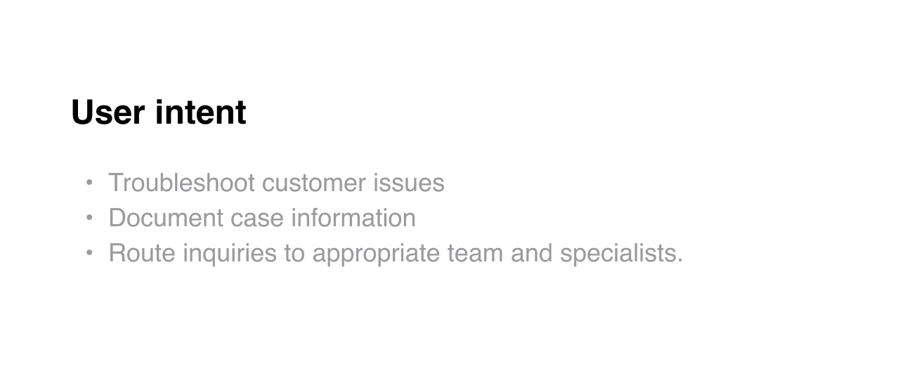
Problem
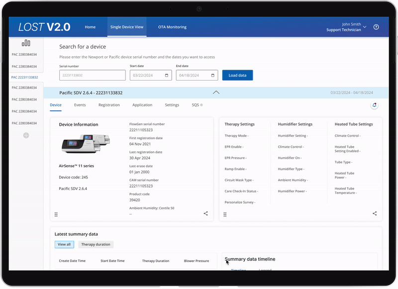
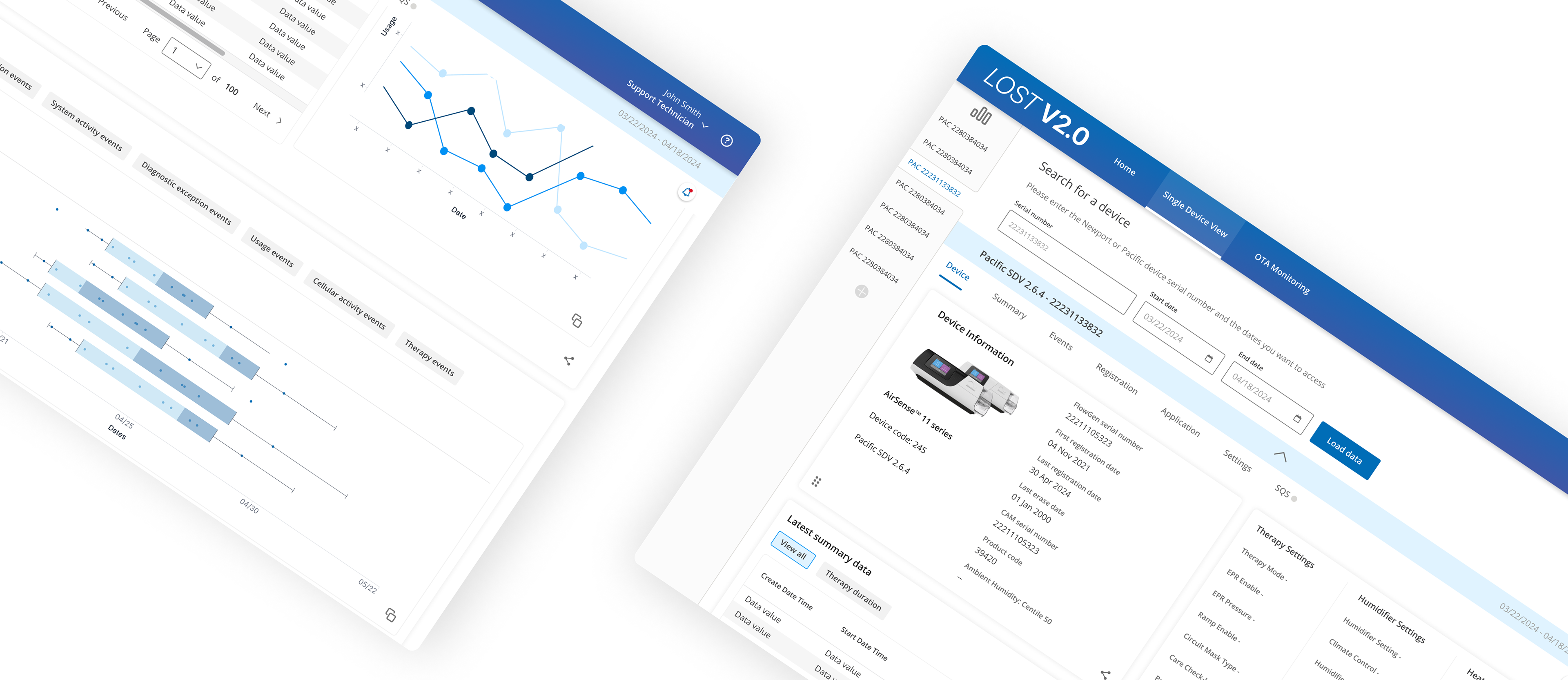
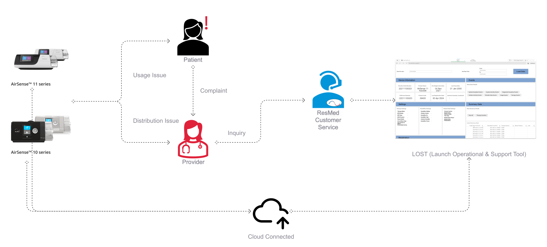
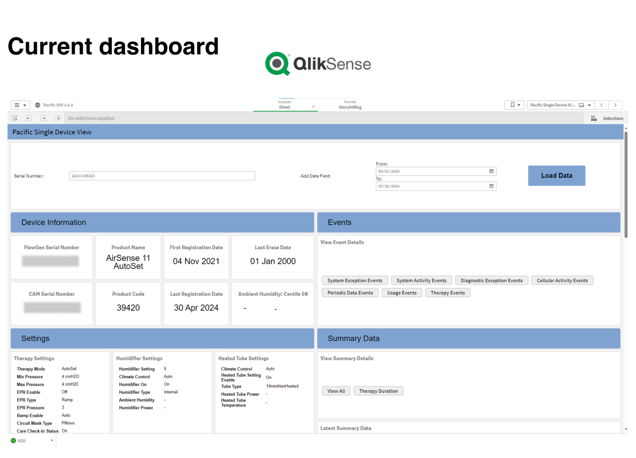
The current LOST (Launch & Operational Support Tool) dashboard is an internal tool for inspecting the status and history of individual devices, typically used in a troubleshooting process. It primarily serves ResMed's Technical Care and Field Service units, which have over 60+ members.
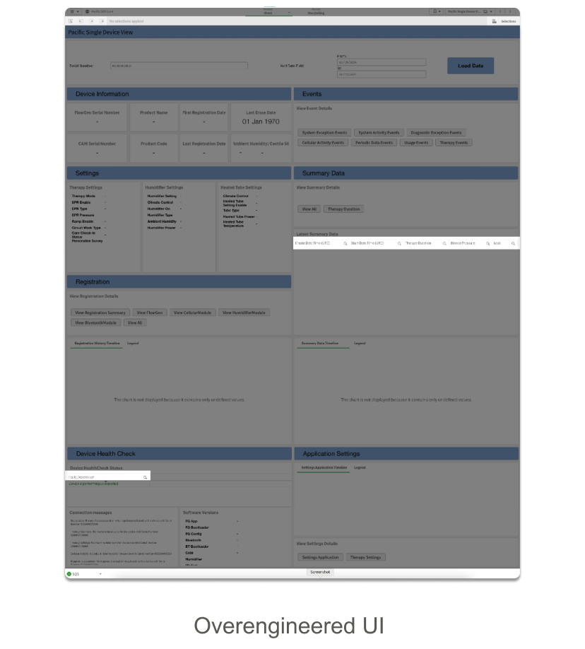
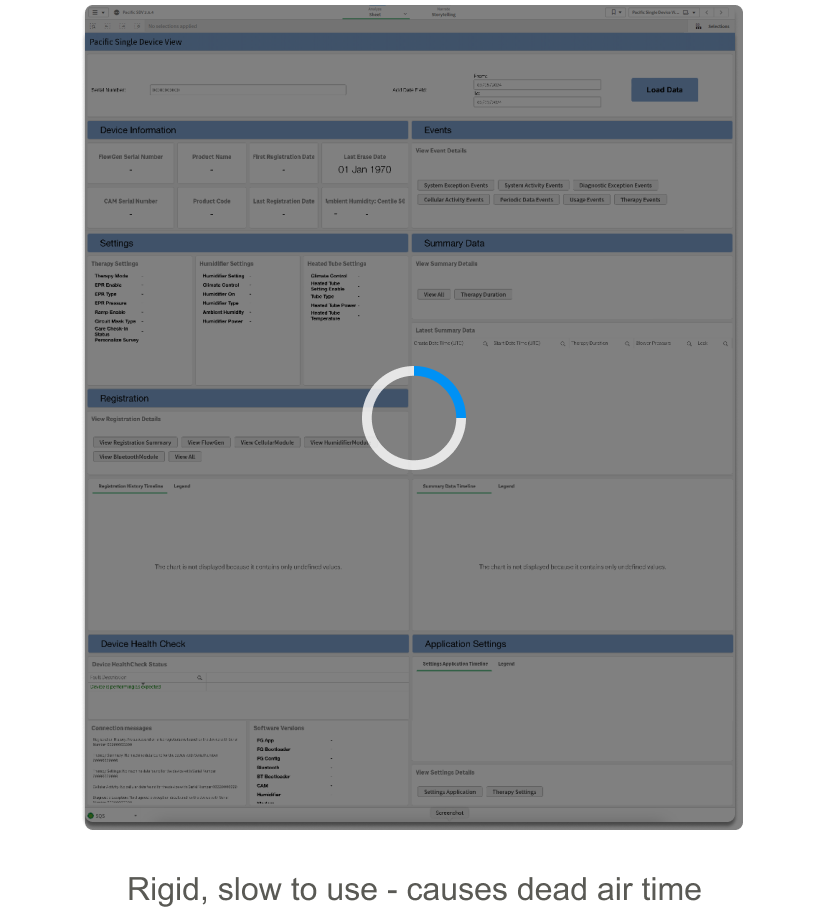
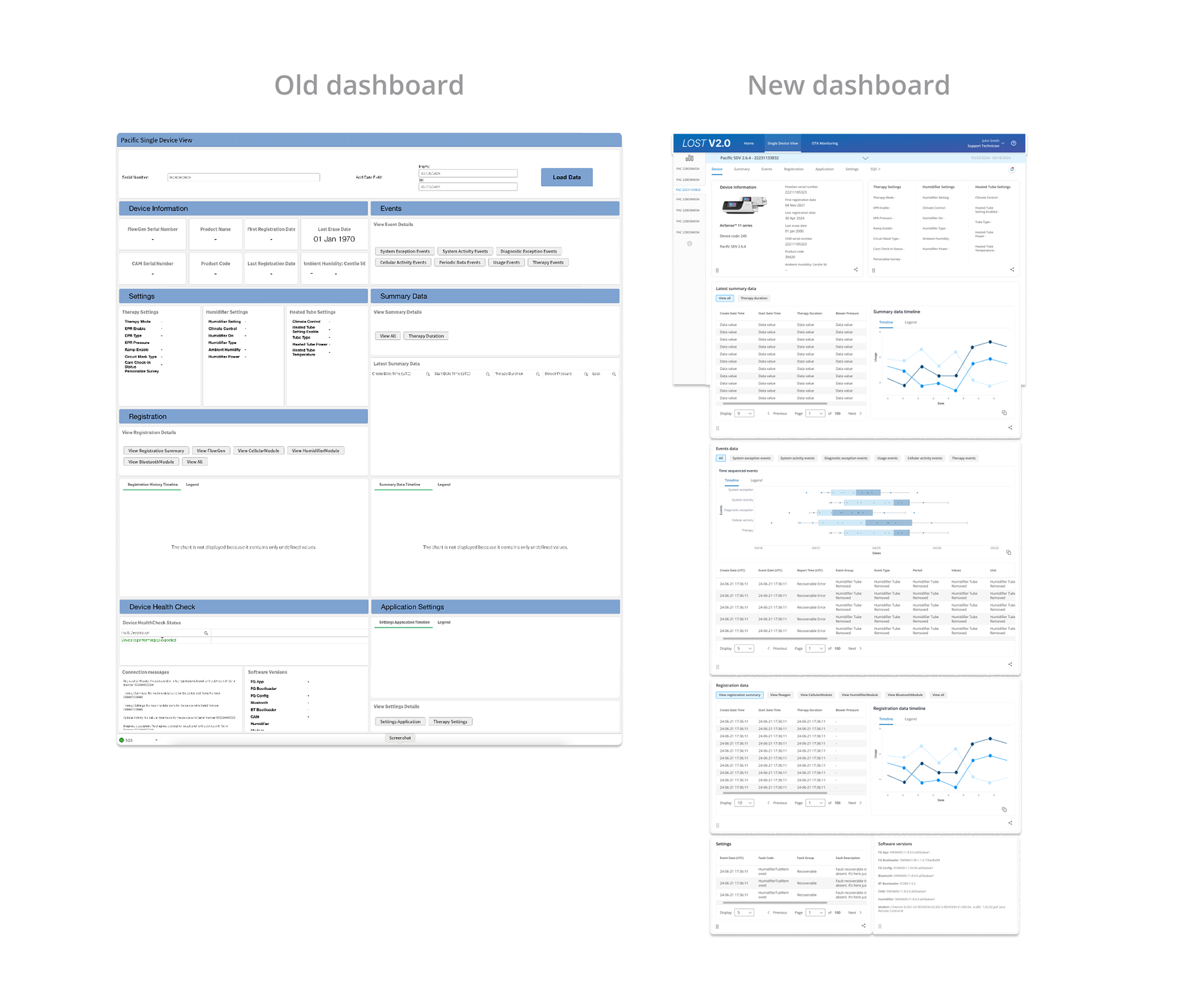
The current tool was put together in a hurry to meet the AirSense 11 product launch date and has many gaps in features and usability. On the usability front, an out-of-the-box solution QlikSense was used to be able to meet the deadline. The interface has no common theme with ResMed design and the QlikSense interface was inflexible and left a lot to be desired. This project proposes a new in-house solution from discovery to concept delivery based on the current power user's feedback and data. With that context, here is our problem statement
User Pain Points
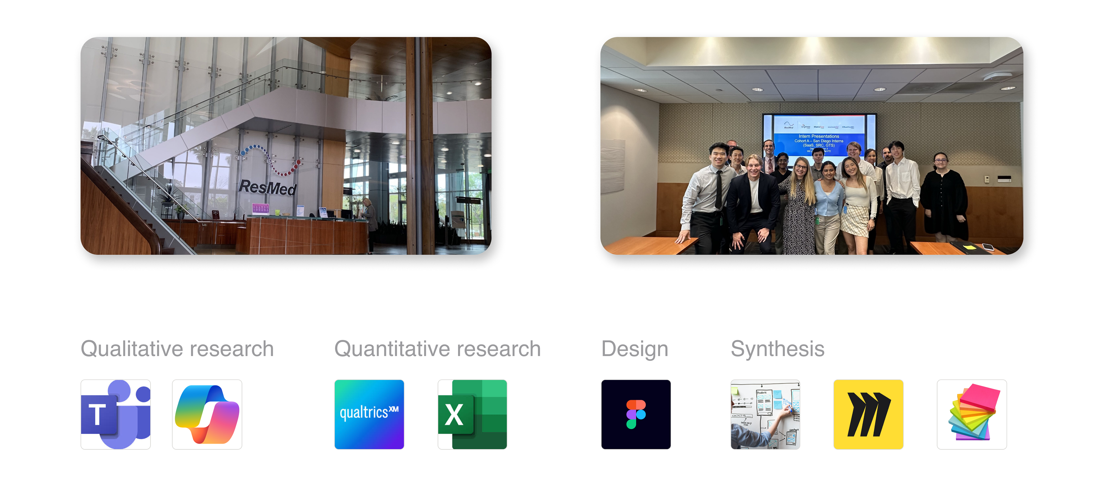
Research & Development
To fully understand the context of the tool, its purpose, and what ways we can improve it, there was a significant amount of research discovery in the divergent phase of our design process. We began by referencing past demos, and documentation regarding the AirSense 10+11 series to try to get a sense of what this tool is.
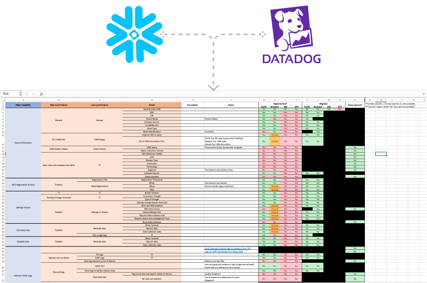
Data Audit
We first had to figure out where is this data coming from, how is it being displayed, and how much of the data from the original plan was implemented into the dashboard. Since all of our CPAP machines are cloud-connected, we receive constant signal input from them as long as they are connected to the internet. This dashboard then gets data from Snowflake and Datadog API's to power the interface.
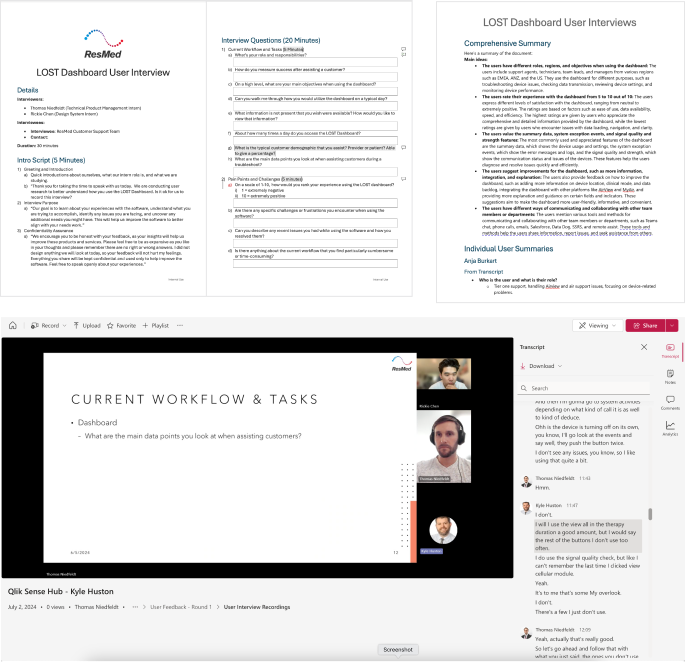
Initial User Interview
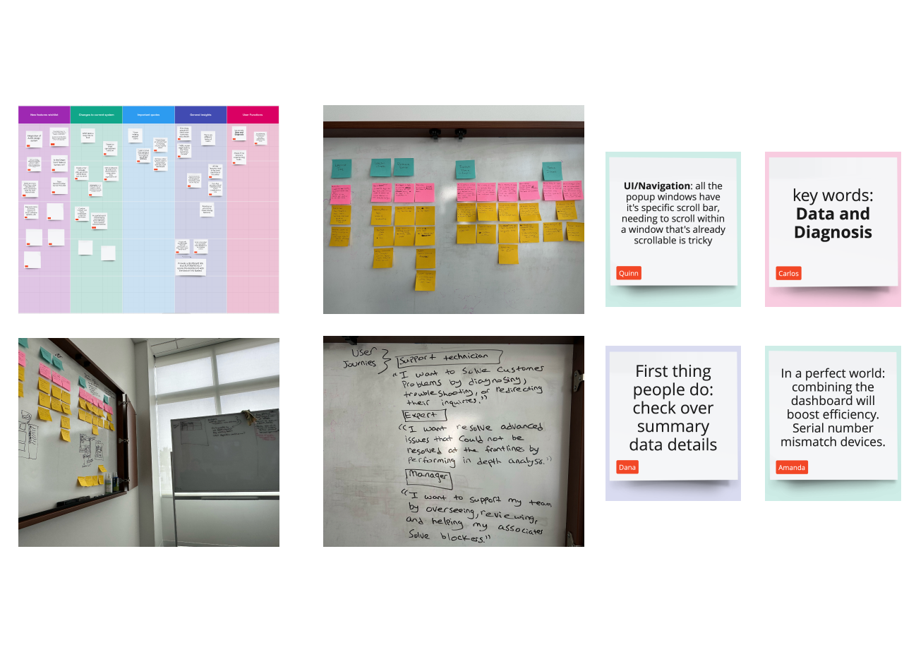
We interviewed 18 users of the LOST dashboard, we reached out to them based on the usage data we got from the administrators. These are power users of the dashboard, we asked them preliminary questions such as how the dashboard functions in their current workflow and what initial pain points they have with the tool.
User Research Synthesis
After the initial interviews, I compiled our interview notes and did some brainstorming regarding insights we got from the interviews. I compiled general insights, key testimonials that stuck out to us, and common pain points that were brought up during the conversations.
User Survey
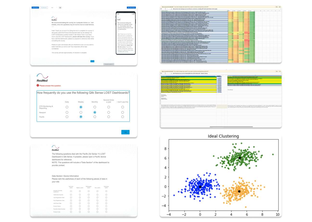
After conducting the initial round of user interviews, I recognized that to effectively promote the dashboard and increase its adoption, we needed to expand our focus beyond power users. With over 60 members of the global Technical Care team, I distributed a survey to assess dashboard usage across the team. The survey aimed to identify why certain members engage with the dashboard more frequently than others, and whether potential users are deterred by its current UI limitations.
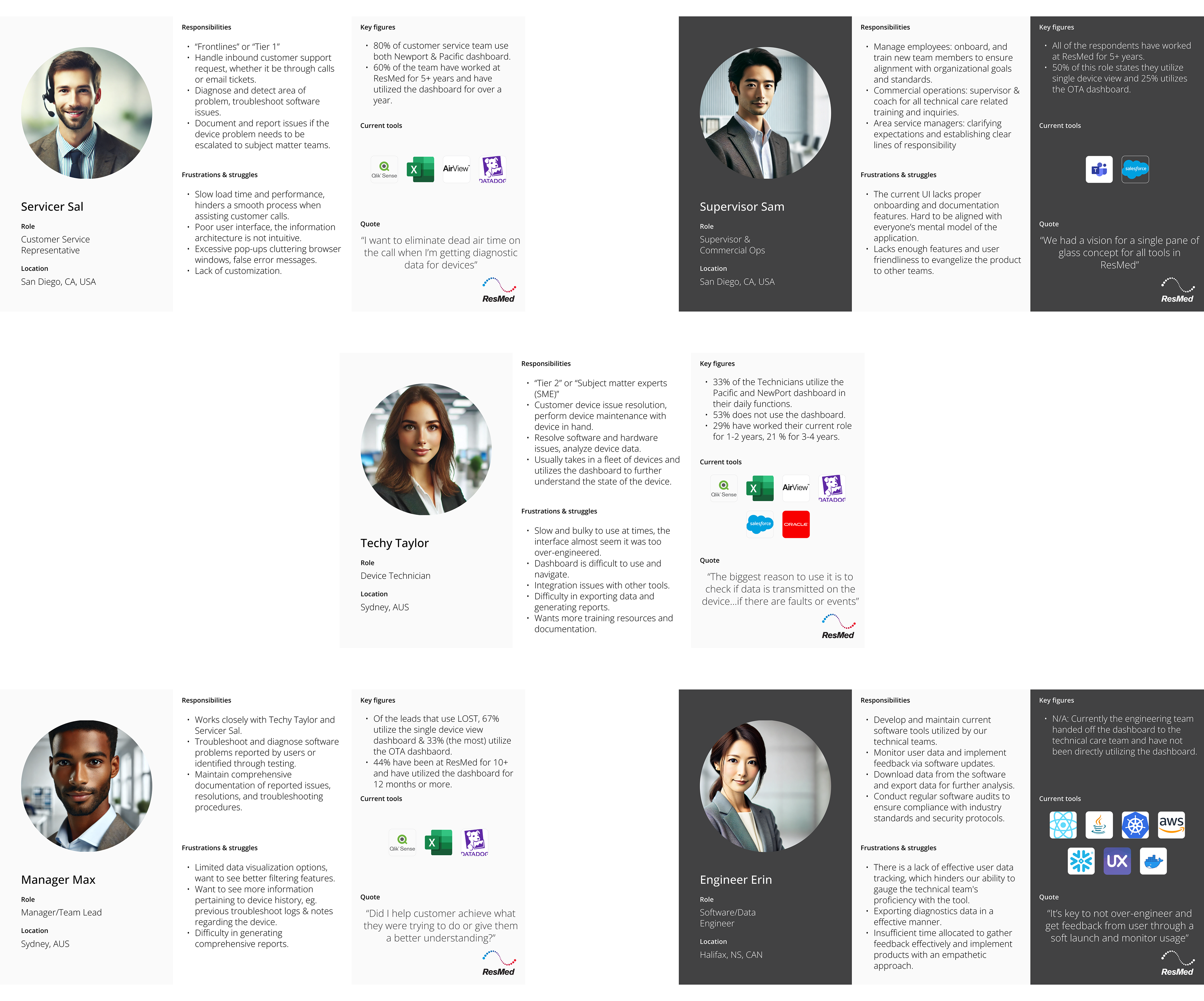
After collecting the survey data, we performed a series of k-means analyses to identify commonalities between the groups of users that answered our survey. In our case, the number of clusters I found to have no significant difference between each other is 5 different data groups, I then labeled the groups and created personas for each one.
User Personas
The user personas were data from both our qualitative user interviews and quantitative user surveys. 5 key groups were identified as the stakeholders of the LOST dashboard and this serves as a good reminder of how each group of people interact with the dashboard. What are the goals of their job function, and how might the new dashboard assist them if not already?
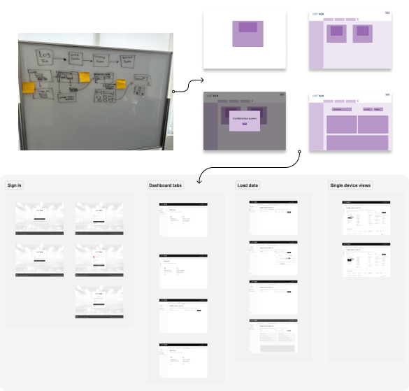
Initial Wireframes
From the research synthesis and feature set brainstorm, I was able to start on some rough preliminary wireframes to map out what the new dashboard could look like. This eventually translated into a low-fidelity prototype on Figma. I then utilize these low-fidelity prototypes that have less granularity on the UI for another round of user feedback sessions. The reason why I didn't polish out the UI is because I want the user to focus more so on the functionality and UX of the dashboard, rather than having a bias because of the improved UI changes.
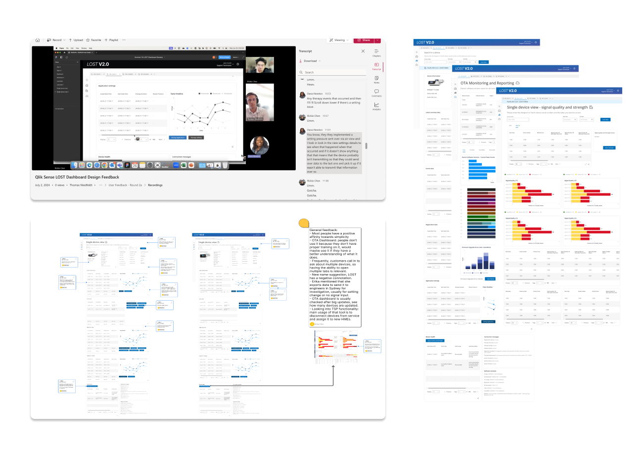
User Feedback Sessions
I conducted 16 user feedback sessions with a prototype. Users initially struggled in our first round to identify potential improvements, however with the prototype, they were able to offer more ideas for improvement. The user feedback session helped users ideate by expanding their vision and we often got reactions like "Oh I did not think of it from that perspective". The survey we sent out earlier helped a lot in identifying who to reach out to for this second round of user feedback, for example, I targeted people who indicated that they use a specific part of the dashboard like signal quality. I was then able to identify users who can help with a specific part of the dashboard I am iterating on. I then made several annotations based on the feedback the users gave during the sessions and continued to iterate the designs.
Design Deliverables
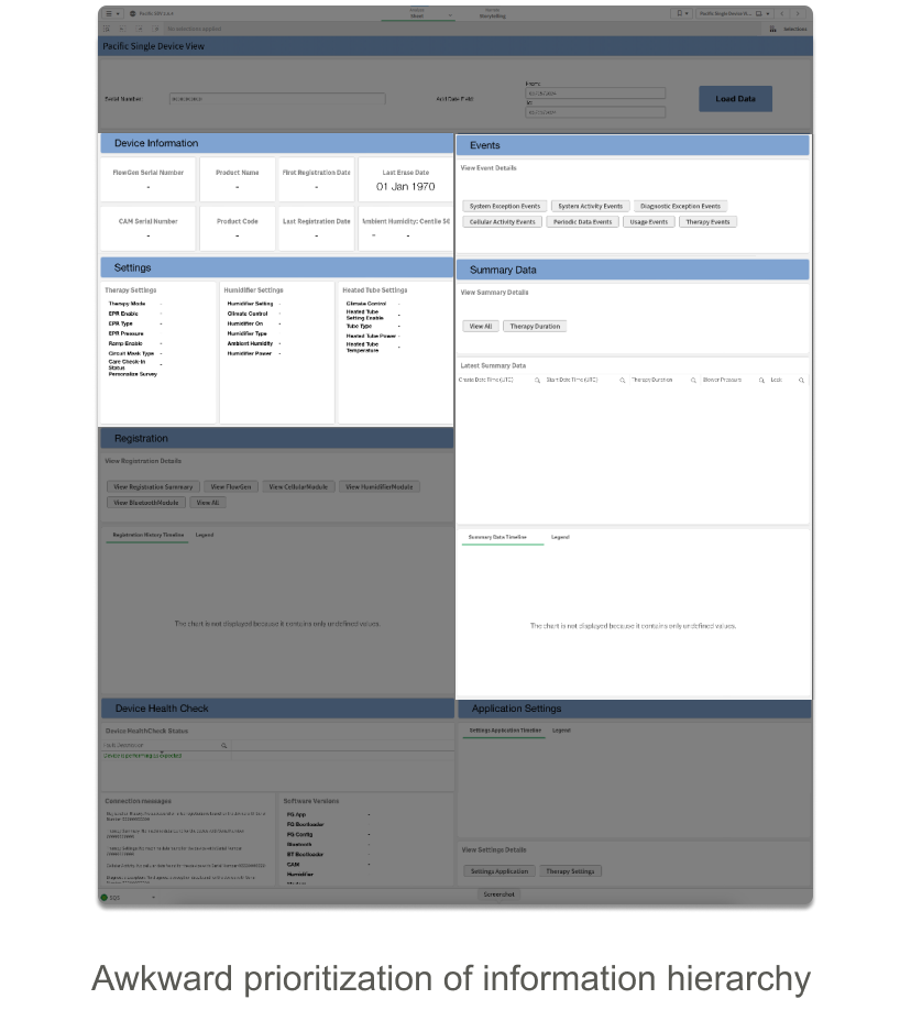
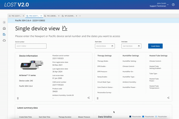
Information Hierarchy Changes
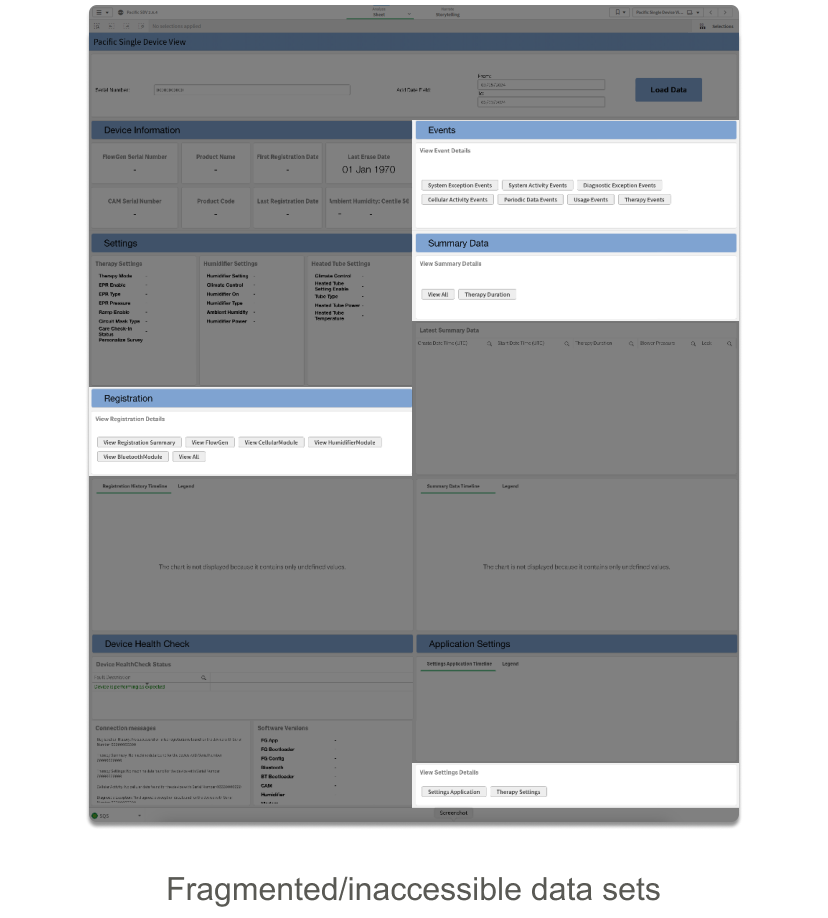
Throughout my research, one key pain point was that the data on the dashboard was not displayed efficiently. Those extra seconds looking for certain data will add up, especially when you're on synchronous calls with customers. Other information hierarchy pain points include the data not being displayed in a traditional left-to-right/up-and-down format, there are too many data points hidden behind pop-ups, and irrelevant information too close to the top.
View device and settings detail
View system exception events
Data segmentation
Different parts of the data are chunked in their respective section, from a left to right orientation. The use of pop-ups is also eliminated, replaced by a toggle window with data separated by chips. The sticky navigation bar up top makes it easier to jump from different sections of the dashboard.
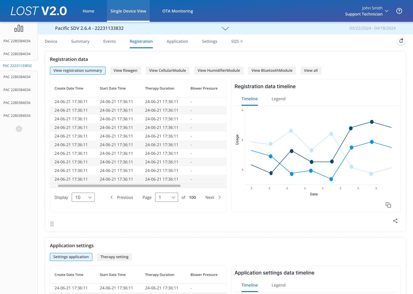
Note: these are dummy data populating the dashboard
Old Data Segmentation
Data Segmentation before
Excessive and reliant use of pop-ups to display data.
Data Segmentation after
Uses a chip-toggle mental model.
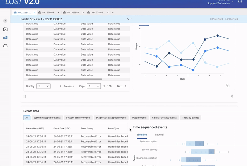
New Data Segmentation
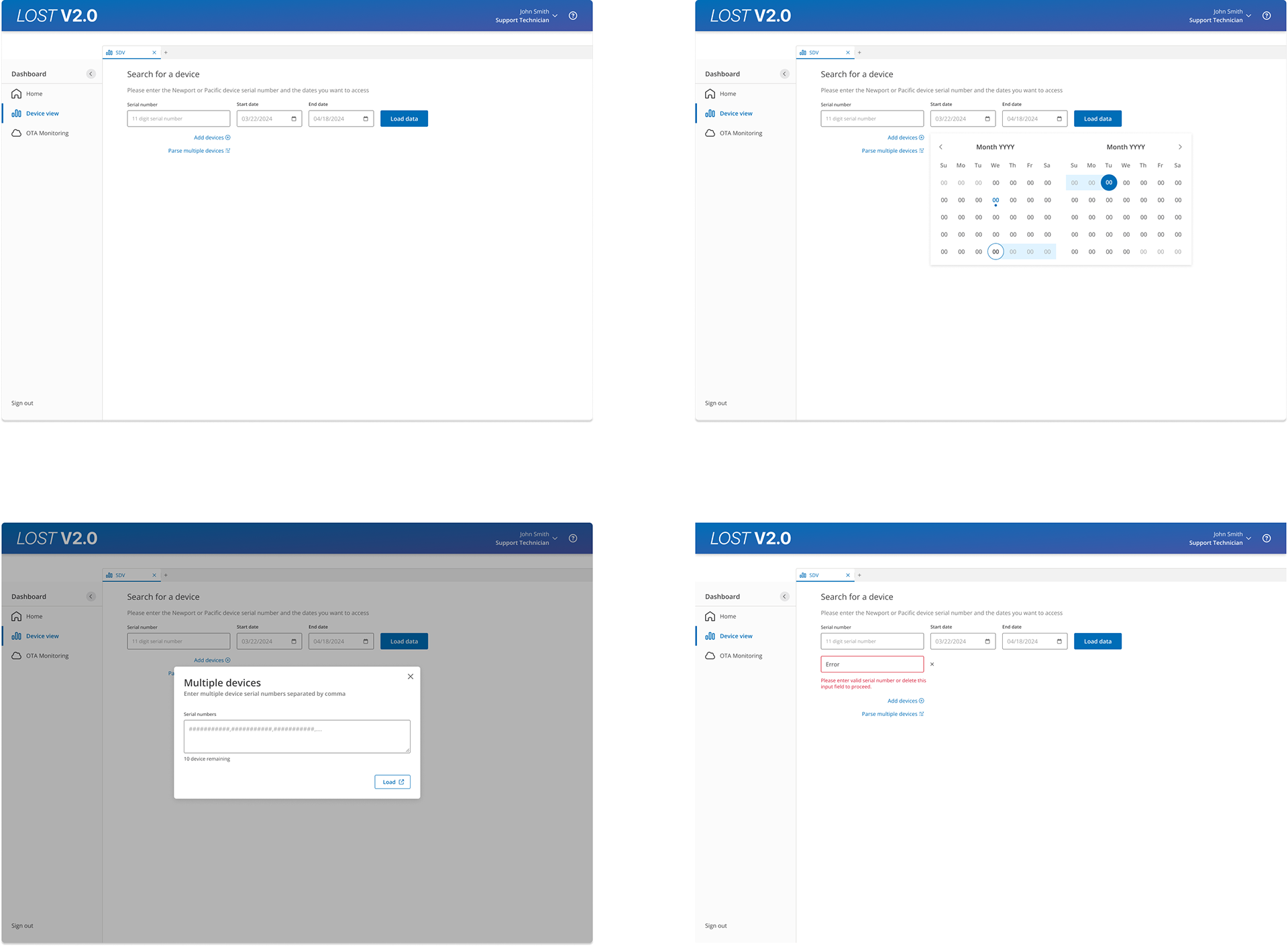
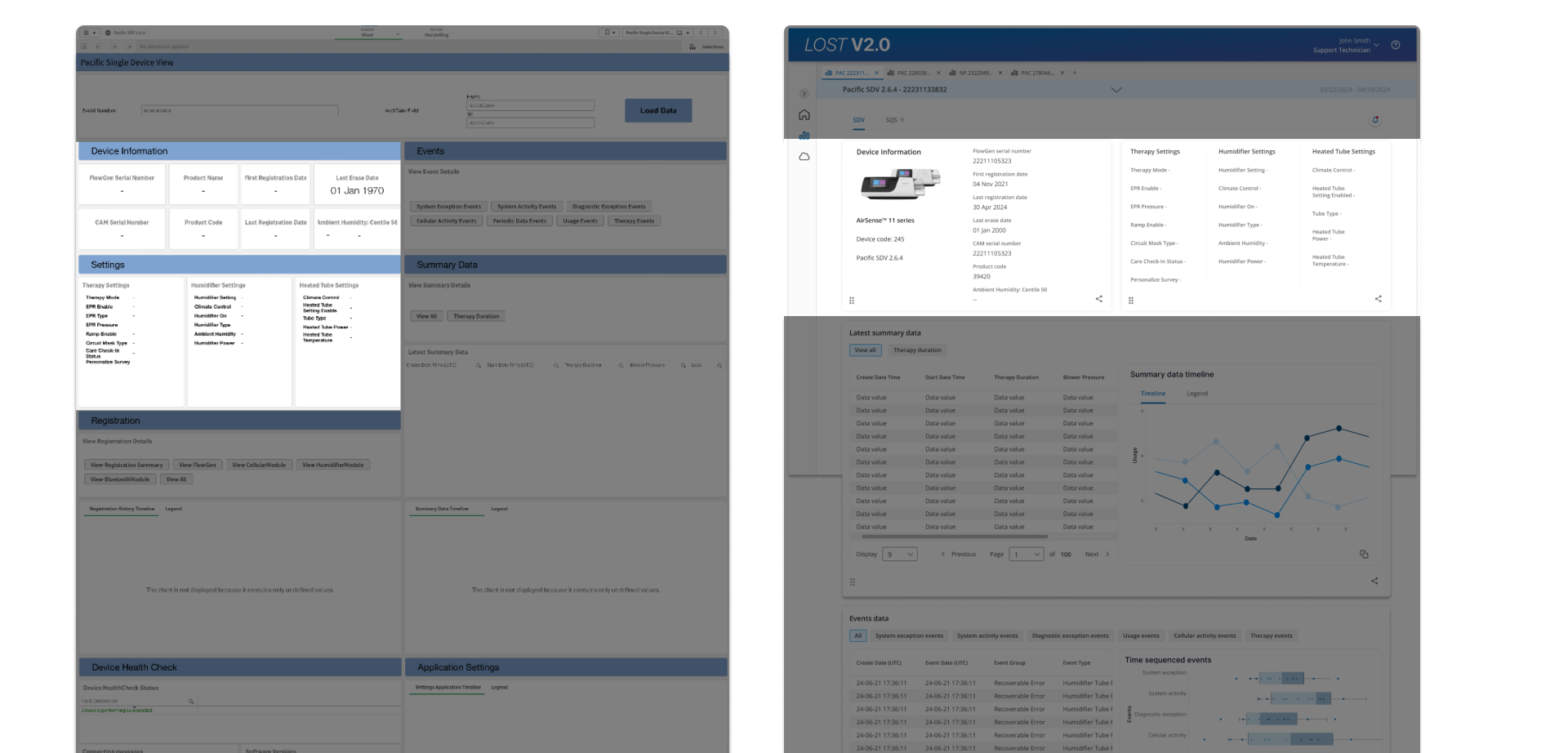
Loading data
A more efficient data loading mechanic, offering the option to load multiple device serial numbers at once. In the previous dashboard, the dashboard wasn't smart enough to differentiate AirSense 10 vs AirSense 11 devices, the new one should be able to differentiate those devices based on the serial number alone.
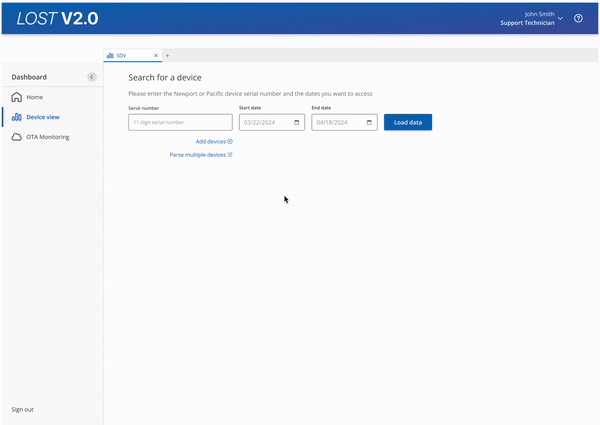
Loading Multiple Devices
Loading multiple device serial numbers at once is beneficial for our service technicians who usually work on a fleet of devices at once at the service centers.
Mutable Dashboard
One feature that was constantly brought up was the ability to customize how information is displayed. This micro-interaction allows the dashboard cards to be draggable similar to an Apple widget adds to the overall user experience.
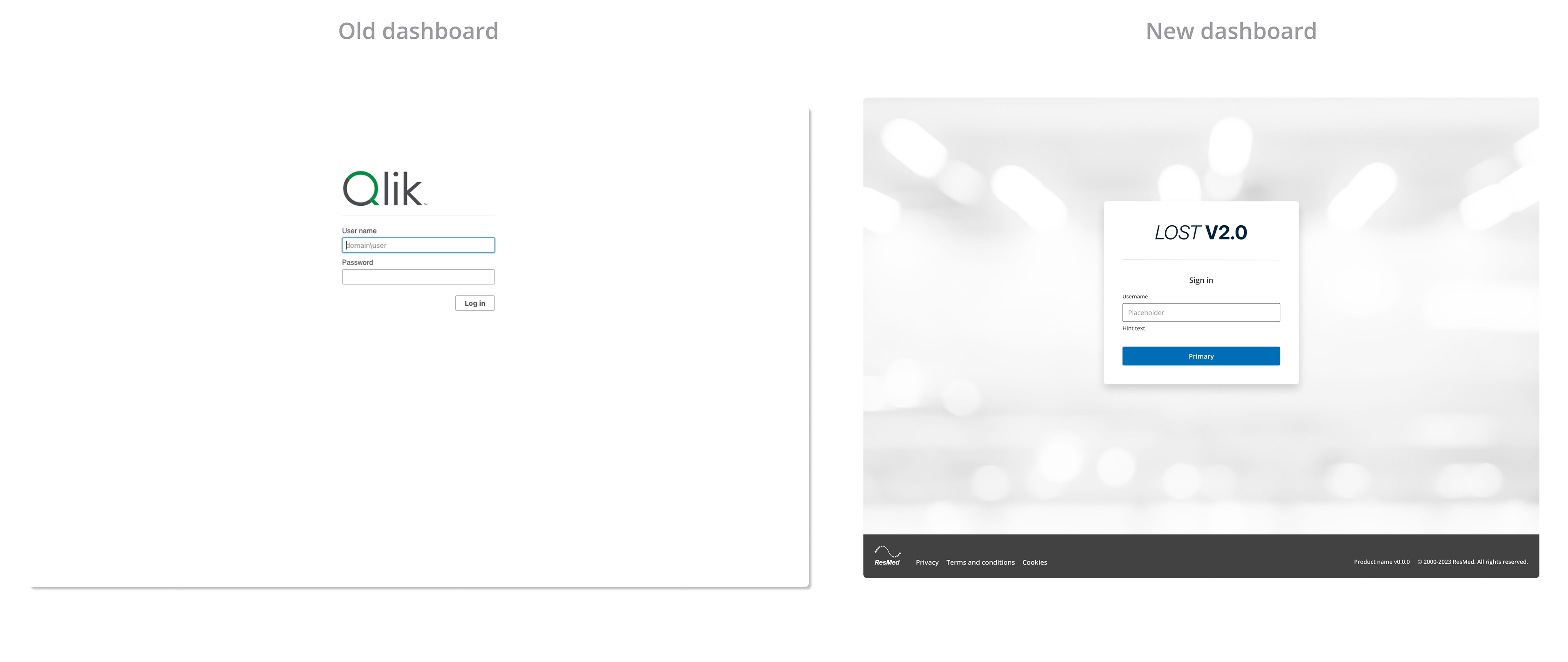
Updated Log-In
I updated the log-in to incorporate ResMed's design system components, giving it a more on-brand and modern experience.
Handoff
Product Requirement Doc
We are not only handing over a set of Figma wireframes, but the product manager and I put together a 30+ page doc highlighting all considerations, the goal of the redesign, product specs, and the development scope.
We have also presented and got more visibility on our product with senior management and parallel teams during meetings discussing improvements to be made across ResMed's suite of internal tools.
Key Takeaways
1. Involve stakeholders early in the process, continue to develop relationships, and iterate with subject matter experts.
2. User feedback sessions: focus on the UX rather than the UI, the less granularity the prototype has, the harsher the feedback will be.
3. Learn how to balance time management, especially when working with a product manager. We used a Gantt Chart to track our work progress and utilized the waterfall approach, however, I had to balance that with my design system tasks that employed agile methodologies.